
Work / 02
T-Lab Bikes: brand system architecture for a titanium bike maker
Full brand system architecture for a Montréal-based manufacturer of premium titanium gravel and road bikes. A decade of craft, made visible.
- Client
- T-Lab Bikes
- Sector
- Premium titanium bicycles
- Scope
- Brand system architecture
The brief
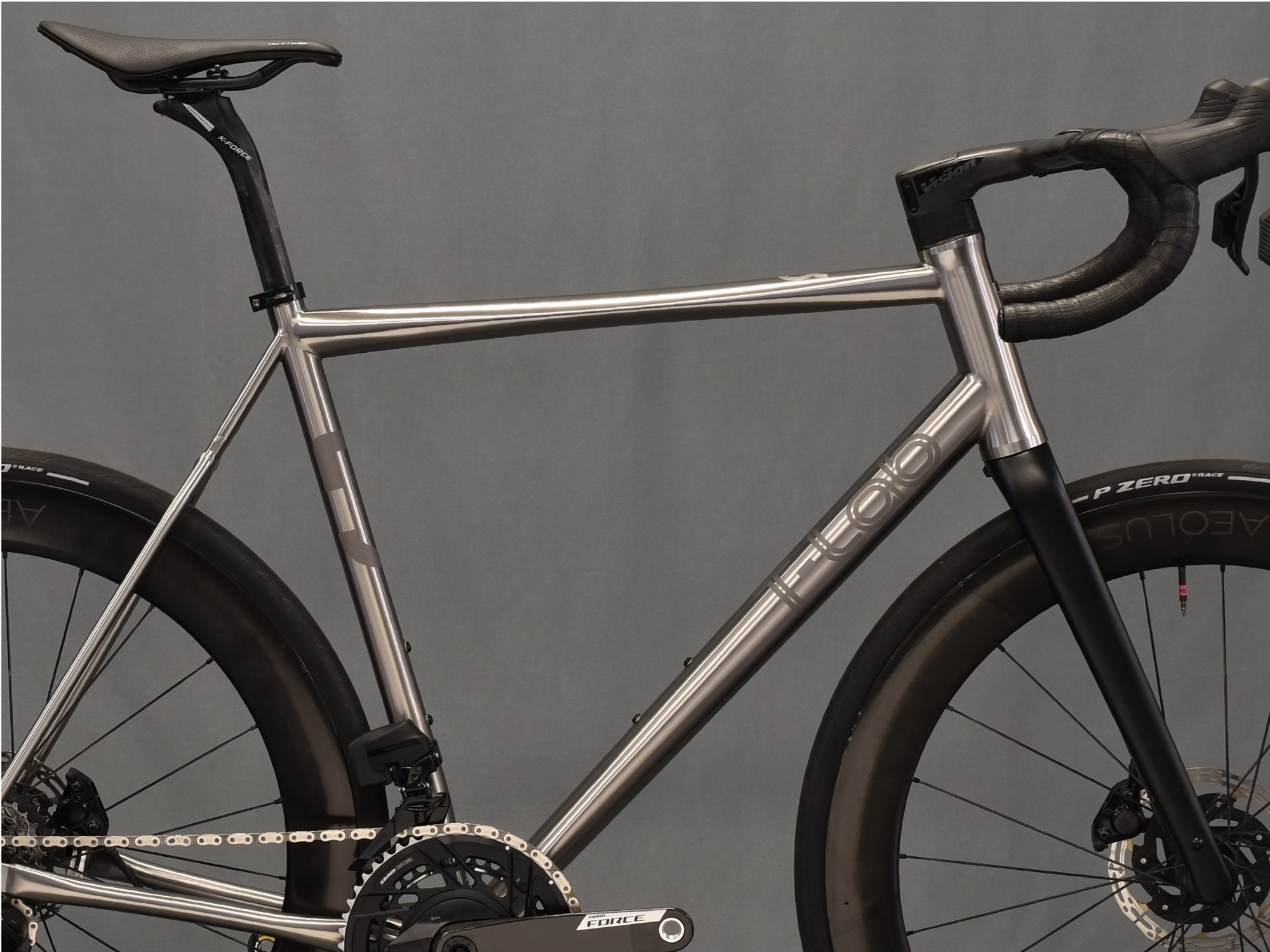
T-Lab builds titanium frames by hand in Montréal and sells them to riders who know exactly what they are paying for. The product had earned its reputation; the brand had not kept pace.
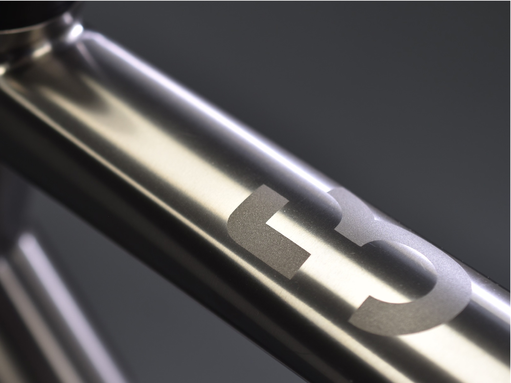
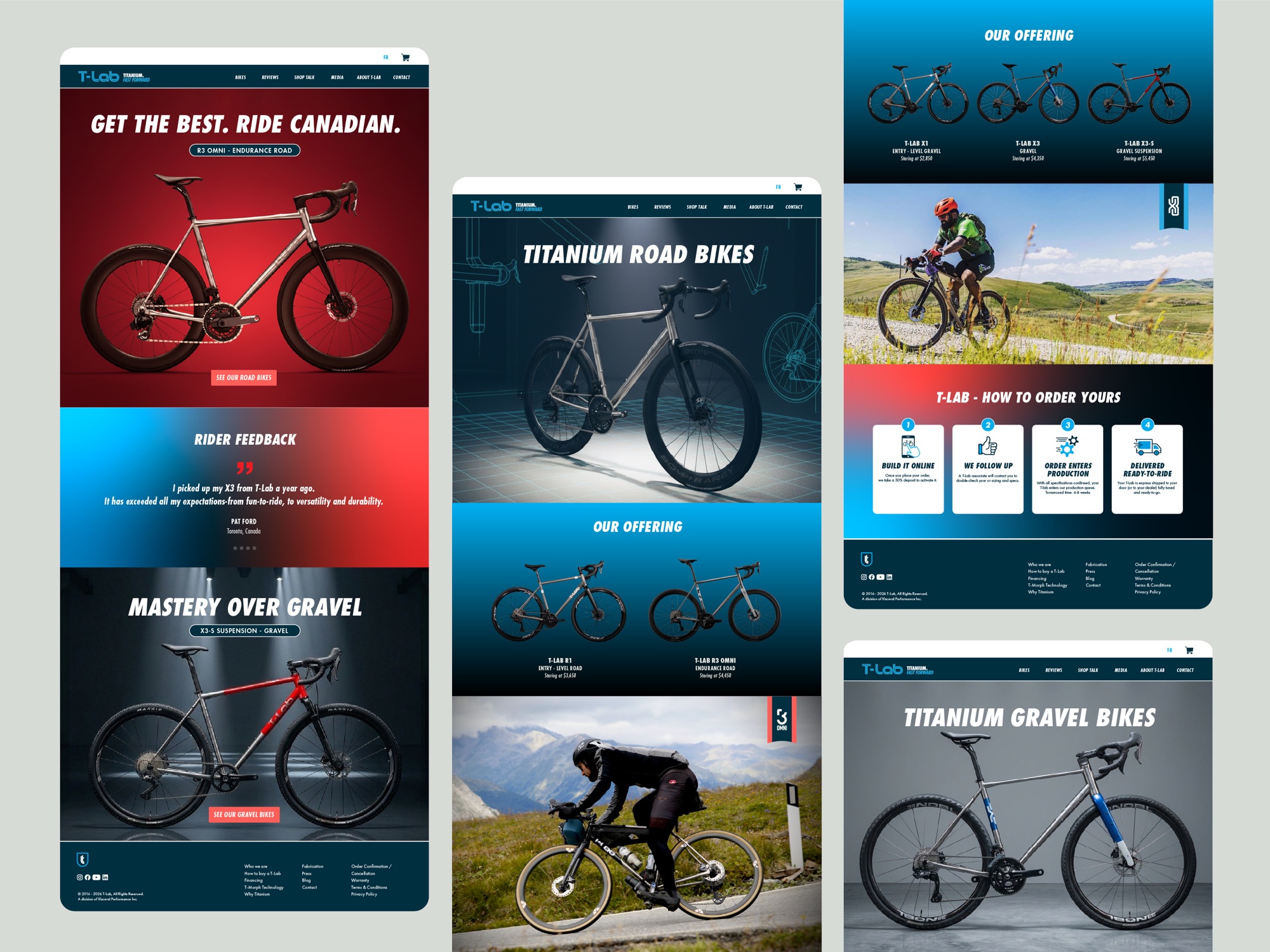
The brief was to make a decade of engineering and craft visible, with a system strong enough to sit on a head tube, a website and a race-day banner with equal authority.
The approach
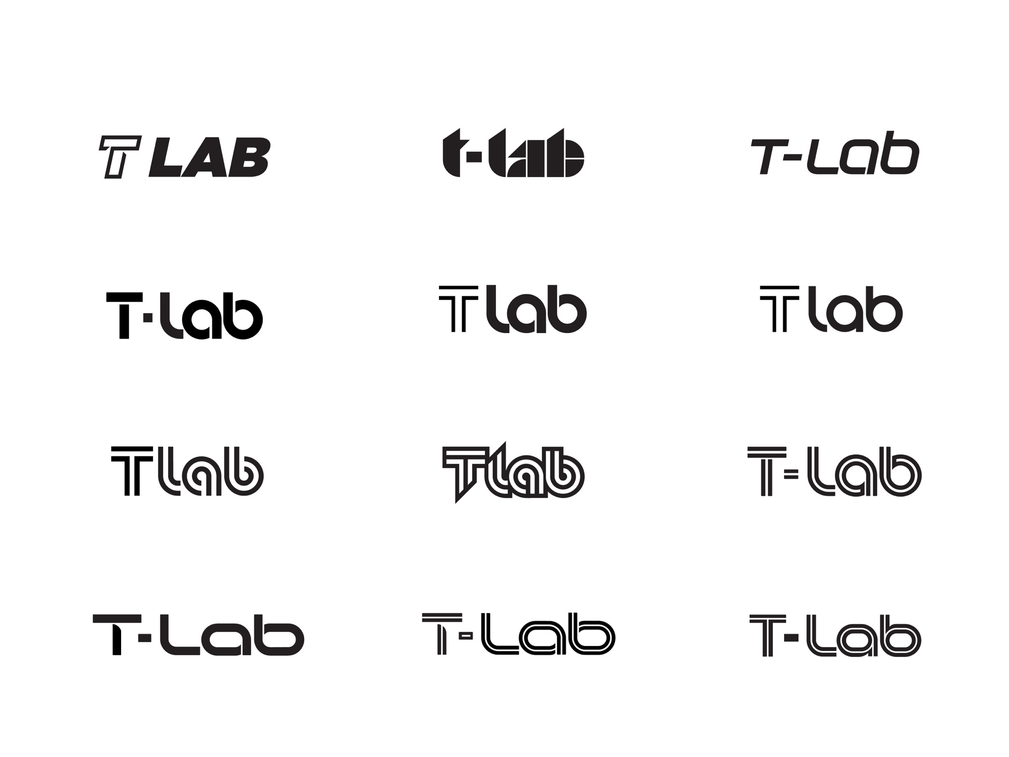
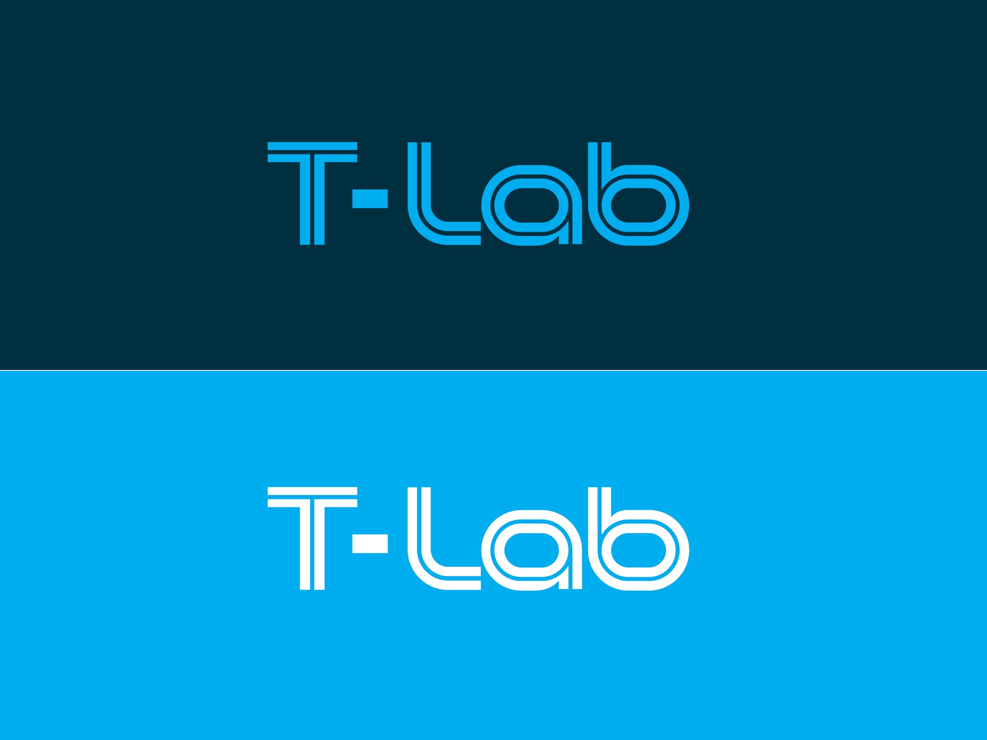
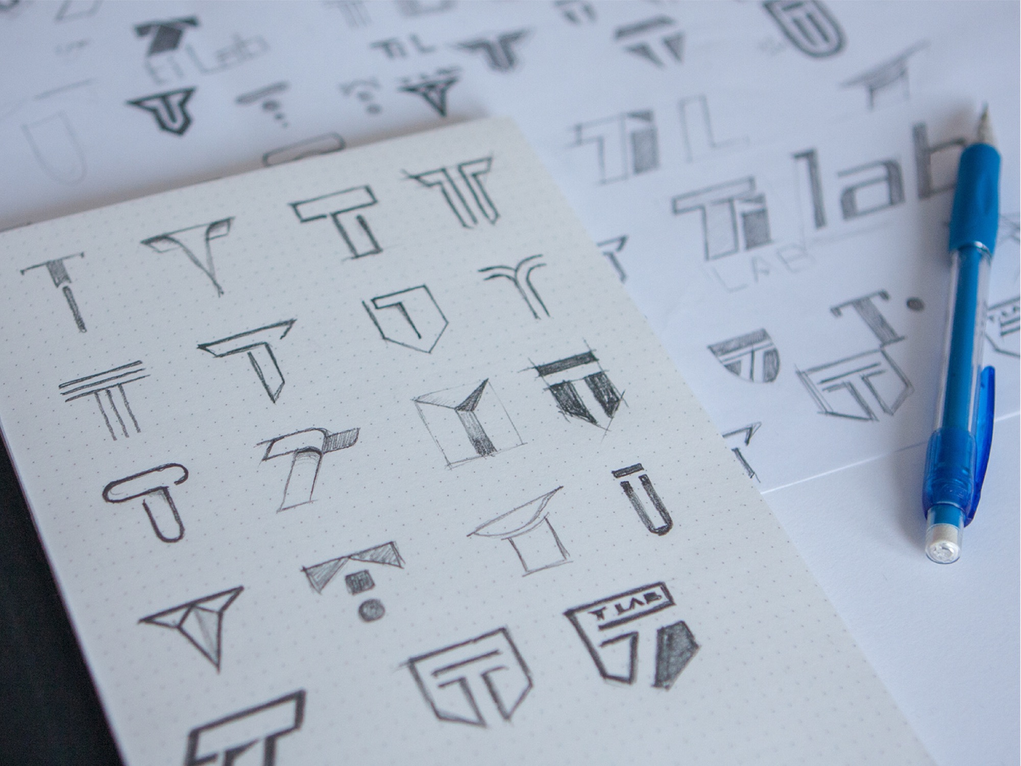
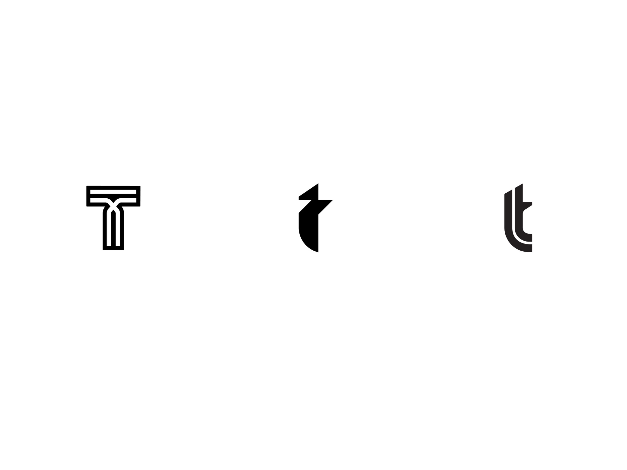
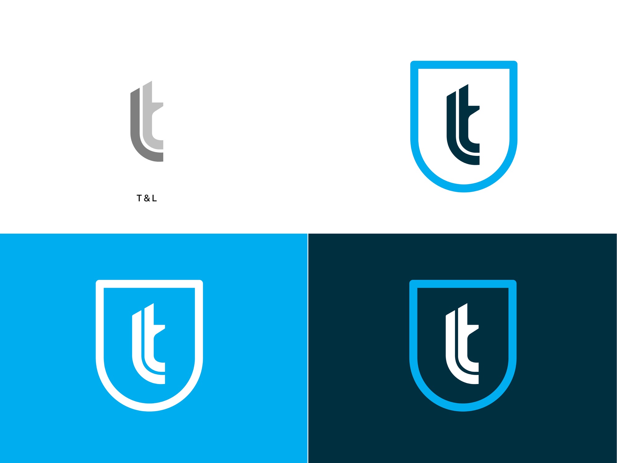
The logotype was rebuilt through a series of explorations, then paired with a compact T monogram developed from sketch to a precise, badge-ready form.
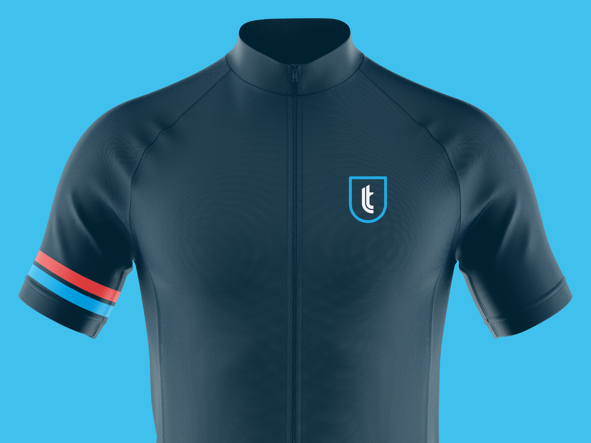
The monogram was set into a shield for frame badges and small applications, and tested across colourways drawn from the product line.
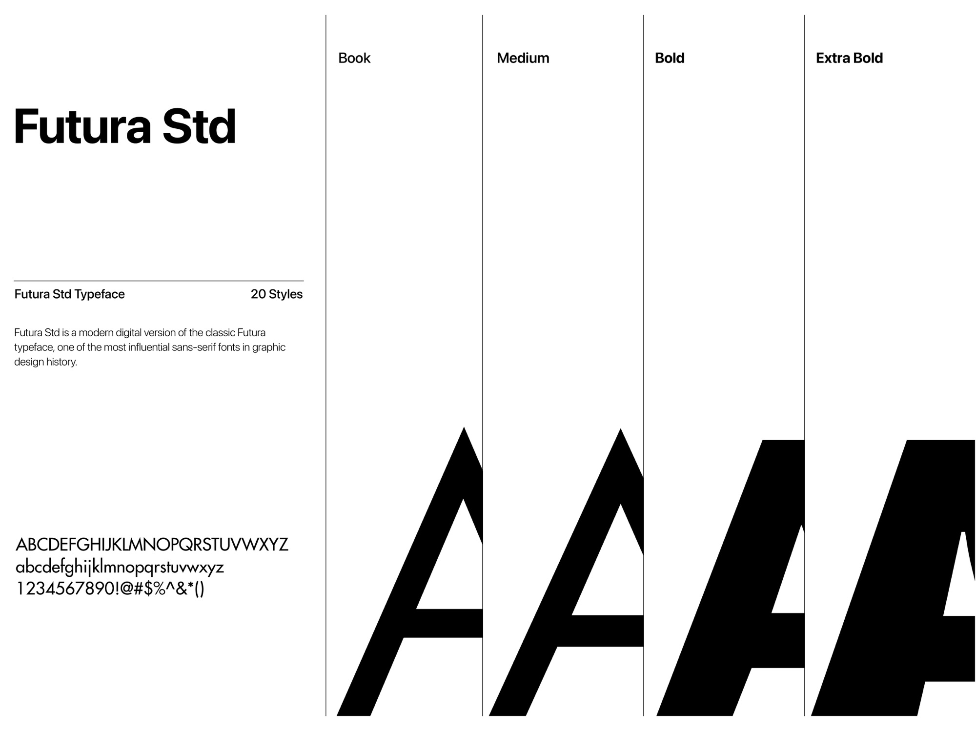
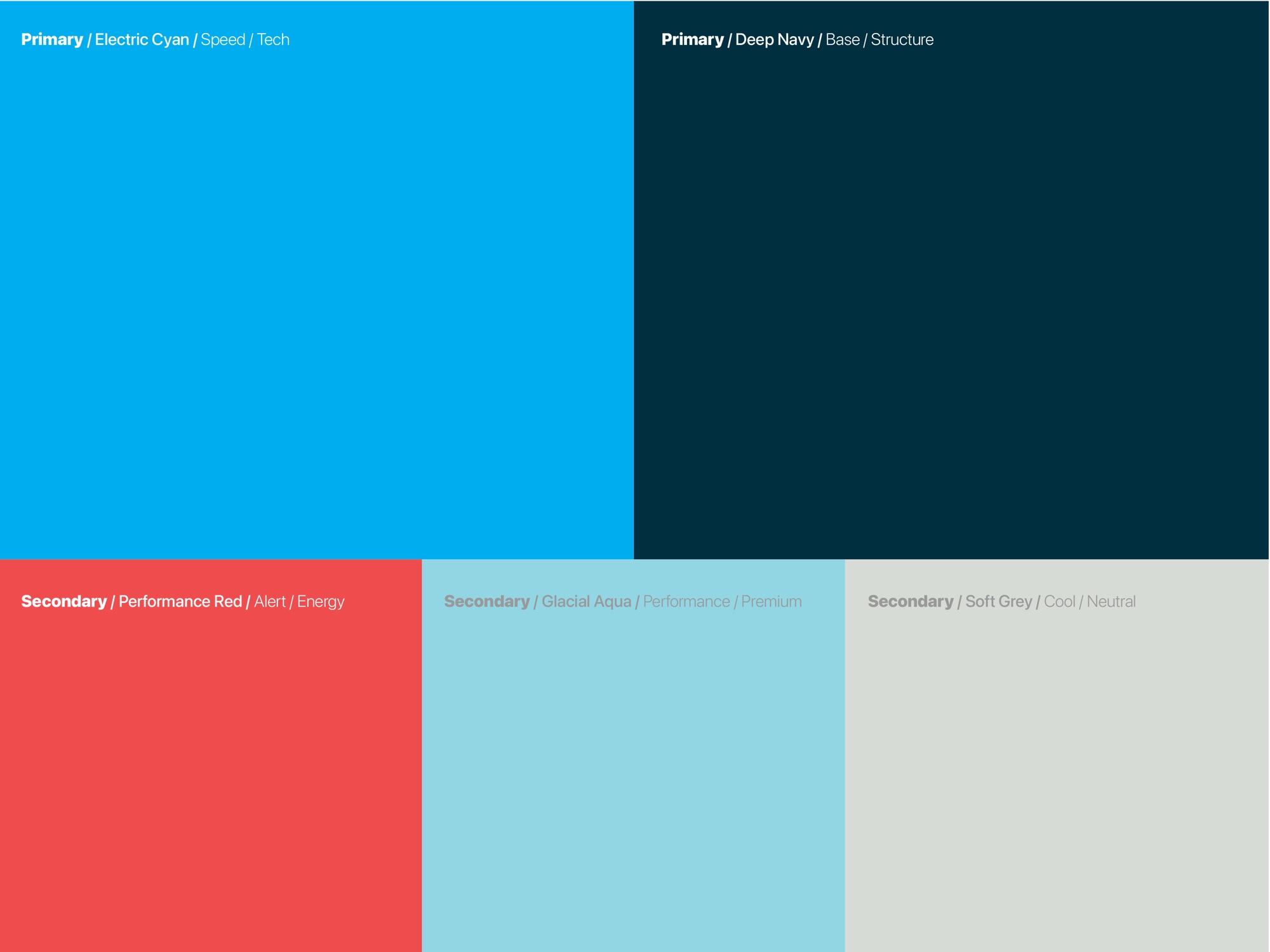
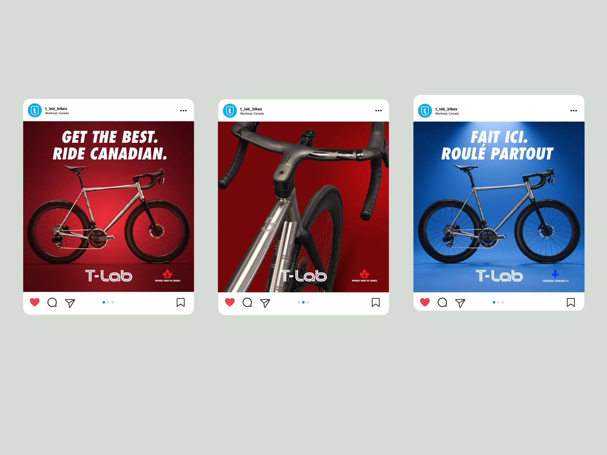
Typography and a defined colour palette tie the system together, carried through product photography, campaign layouts, social templates and merchandise.
Deliverables
- Logotype explorations and final logotype
- Monogram development
- Shield badge and colourways
- Typography system
- Colour palette
- Campaign and advertising layouts
- Social media templates
- Merchandise


Investing in long-term brand equity? Begin with identity.
Start a project →